Studio visits in Osprey, FL let collectors view paintings at various stages and understand true scale before committing. See how in-person viewing transforms art selection.

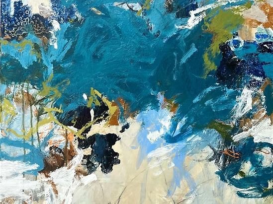
Discover how custom art commissions in Nokomis, FL create original one-of-a-kind pieces built around your personal vision, space, and style with Tammy Keller Art.
Find reliable art consulting in Port Charlotte. Local insights and tips to help Port Charlotte homeowners make informed decisions about art consulting services.

Expert art consulting guidance for Naples residents. Learn how to choose the right consultant and what to expect from quality services.
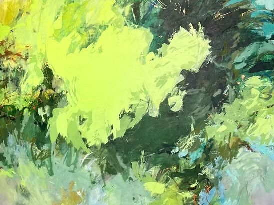
Find reliable contemporary artists in Bradenton. Local insights and tips to help Bradenton homeowners make informed decisions about contemporary artwork.
Expert art consulting guidance for Sarasota residents. Learn how to choose the right consultant and what to expect from quality services.

Find reliable art commissions in Venice. Local insights and tips to help Venice homeowners make informed decisions about custom artwork.
Expert contemporary art guidance for Nokomis residents. Learn how to choose the right artist and what to expect from quality artistic services.
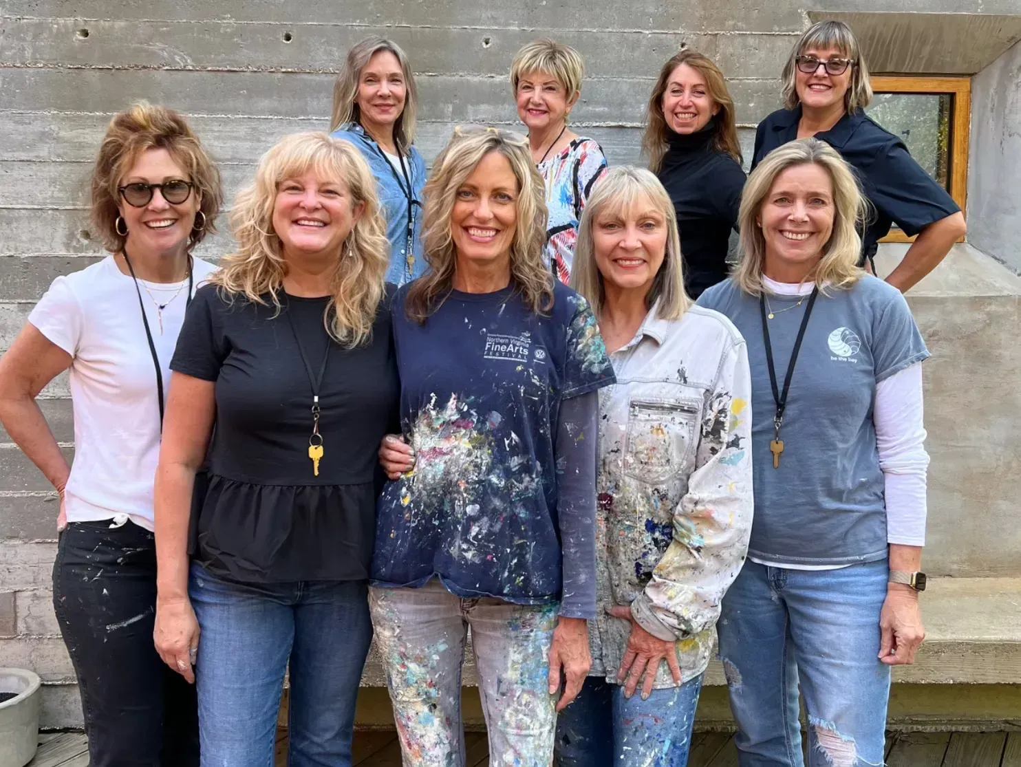
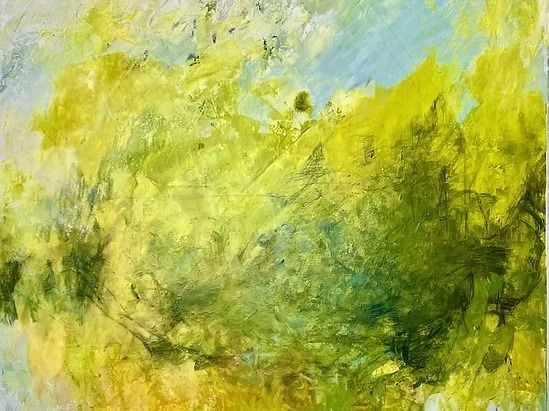
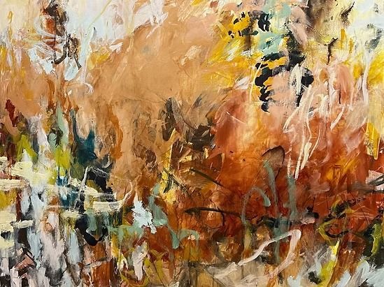
This creative life is not an easy one, but it is what I work on daily.
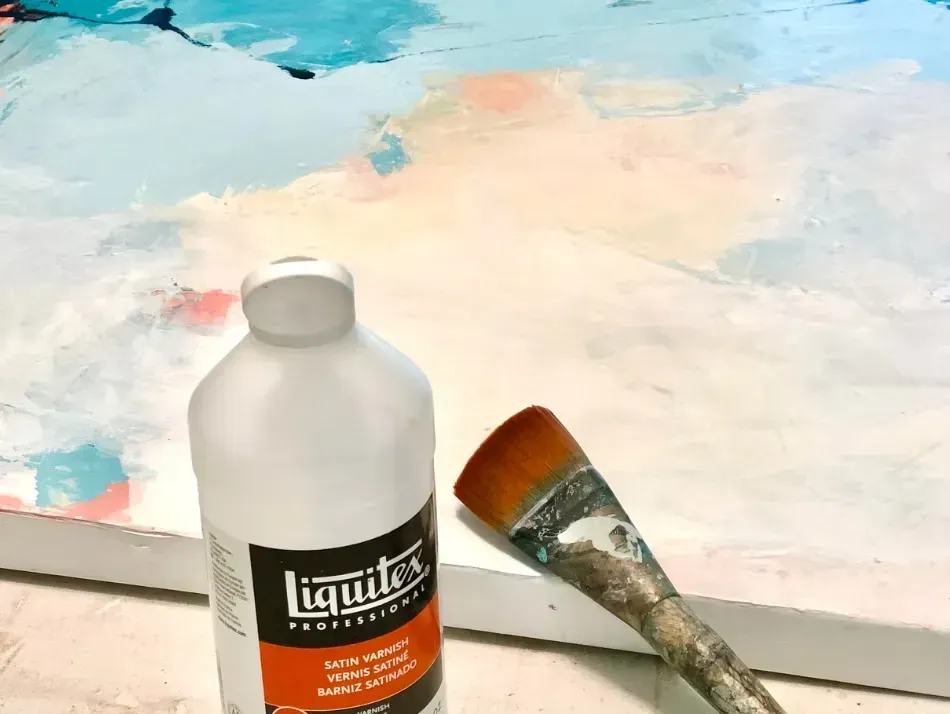
“All you need to paint is a few tools, a little instruction, and a vision in your mind.”